Key Takeaways
- The Indian Premier League helped establish the commercial potential of city-based Twenty20 teams.
- The Abu Dhabi T10 and similar short-format competitions have added another level of franchise cricket, offering compact matches, international player recruitment and new commercial opportunities.
- In September 2026, Durban’s Super Giants unveiled a redesigned logo and a red, blue and gold color palette for their next SA20 season.
- The International League T20 has developed a stable six-team structure in the United Arab Emirates.
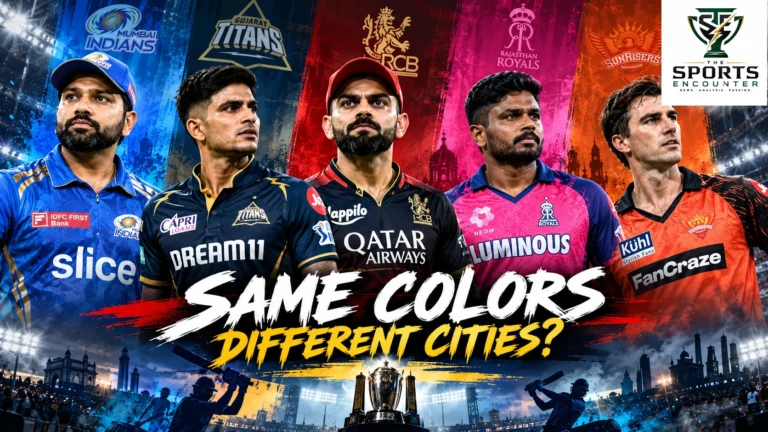
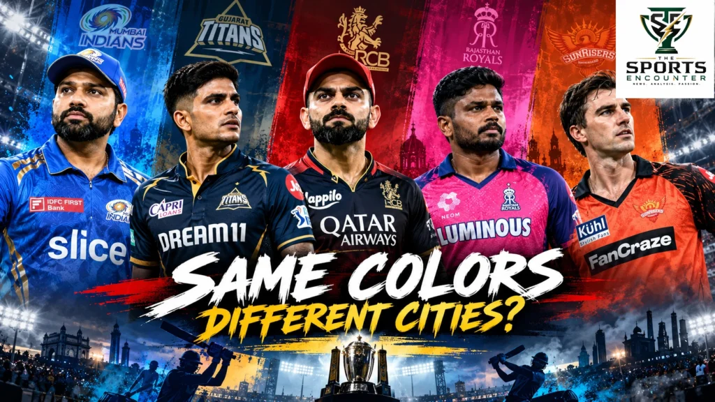
LONDON, United Kingdom, October 31, 2026: Mumbai Indians and Gujarat Titans both draw heavily on blue and gold. Delhi Capitals and Punjab Kings compete for recognition within cricket’s crowded red-and-blue spectrum. In South Africa’s SA20, multiple franchises inherited branding from Indian Premier League owners, while the Super Giants group has now deliberately aligned its teams across India, South Africa and England. Across T20 and T10 cricket, the growing resemblance between franchise uniforms raises an uncomfortable question: why are businesses investing heavily in cricket teams without always making those teams visually distinctive enough for fans to recognize immediately?
The problem extends beyond two similar shirts. Cricket is experiencing a proliferation of franchise brands, ownership networks, player movements and tournament rebrands. A supporter may encounter the same broad colors, a familiar team name or a related logo in several countries, sometimes with different players and local histories. Chennai Super Kings, Joburg Super Kings and the wider Super Giants and Knight Riders families illustrate how global identities travel. Yet franchises also need supporters to feel connected to their own cities. The challenge is to balance commercial consistency with a recognizable, authentic local identity that can survive annual kit launches and frequent squad changes.
Cricket’s Franchise Boom Has Created a Visual Identity Problem
Franchise cricket has grown into an international marketplace of clubs, players, sponsors, investors and broadcasting rights.
Story at a glance
Cricket’s Franchise Boom Has Created a Visual Identity Problem
Franchise cricket has grown into an international marketplace of clubs, players, sponsors, investors and broadcasting rights.
Which Franchise Cricket Kits Risk Looking Too Similar?
The most useful starting point is a comparison of actual franchise identities rather than a general complaint about repetitive design.
Mumbai Indians vs Gujarat Titans: How Much Blue Is Too Much?
Mumbai Indians have one of franchise cricket’s most established visual identities.
Delhi Capitals, Punjab Kings and the Crowded Red-and-Blue Market
Delhi Capitals and Punjab Kings illustrate a related problem.
Why Chennai Super Kings and Rajasthan Royals Show the Value of Owning a Color
Some IPL franchises have managed to establish especially recognizable visual identities.
Read next Mark Chapman Leaves New Zealand Central Contract for BBL Opportunity as Franchise Cricket Pull Grows
The Indian Premier League helped establish the commercial potential of city-based Twenty20 teams. The Pakistan Super League, Big Bash League, Caribbean Premier League, Bangladesh Premier League, SA20, International League T20, Major League Cricket and other competitions have since developed their own identities and audiences.
The Abu Dhabi T10 and similar short-format competitions have added another level of franchise cricket, offering compact matches, international player recruitment and new commercial opportunities.
Every league has its own structure. Some franchises have existed for more than a decade. Others are new. Some are closely associated with established cities, while others depend heavily on their owners, star players or tournament identity.
That diversity makes branding more important.
When fans follow national cricket, they usually recognize a team through an existing national connection. A Pakistan supporter does not need a marketing campaign to understand why Pakistan’s cricket team matters.
A new franchise cannot assume that attachment.
It must create reasons for people to recognize the team, identify with it, follow its progress and eventually become loyal supporters.
The playing kit is one of the most visible tools available to achieve that objective.
Yet too many franchises operate within a limited visual vocabulary: blue, red, gold, purple and black, supplemented by lightning graphics, gradients, geometric patterns and sponsor branding.
These elements are not automatically poor design choices. Some have strong historical associations with individual teams.
The difficulty arises when several franchises produce similar overall impressions, especially from a television camera positioned far from the players.
Fine patterns disappear. Different shades of blue merge visually. Sponsor graphics compete with team names, and fans are left relying on score overlays rather than the kit itself to identify the franchise.
Which Franchise Cricket Kits Risk Looking Too Similar?
The most useful starting point is a comparison of actual franchise identities rather than a general complaint about repetitive design.
Three types of overlap deserve attention: franchises sharing dominant colors within the same competition, teams using similar visual systems in different countries, and ownership groups deliberately extending common branding across their international portfolios.
These are different situations and should be evaluated separately.
| Franchises or Groups | Documented Branding Overlap | Potential Recognition Problem | Important Distinction |
|---|---|---|---|
| Mumbai Indians and Gujarat Titans | Blue and gold families | Similar broad impressions from distant cameras | Different shades, motifs and team identities |
| Delhi Capitals and Punjab Kings | Red-and-blue associations | Overlapping shirt colors and familiar contrast combinations | Different crests, proportions and designs |
| Lucknow Super Giants and Durban’s Super Giants | Owner-driven global identity alignment | Local franchises may resemble a wider corporate family | Durban’s 2026 redesign explicitly seeks common branding |
| Mumbai Indians, MI Cape Town and MI Emirates | Shared MI franchise name and visual heritage | Local team identity can become secondary to the MI brand | Common identity is commercially deliberate |
| Kolkata Knight Riders and other Knight Riders teams | Related names, crests and brand language | Similar identity cues across different markets | Shared branding reflects a franchise network |
| Sunrisers Hyderabad, Sunrisers Eastern Cape and SunRisers Leeds | Common Sunrisers brand family | Regional teams can appear to be extensions of a global brand | Recognizability across markets is an intentional advantage |
| Chennai Super Kings and Joburg Super Kings | Related names and visual heritage | Distinct local identity may be less visible | Familiarity benefits supporters who know the original franchise |
| Abu Dhabi T10 expansion franchises | Several new identities entering one tournament | Limited time to establish distinct recognition | 2026 final playing-kit similarities require individual verification |
This is an editorial overlap map, not a statistical finding that supporters confuse every listed pairing.
The most significant evidence comes from the franchises that have publicly described their own design and commercial strategies.
Mumbai Indians vs Gujarat Titans: How Much Blue Is Too Much?
Mumbai Indians have one of franchise cricket’s most established visual identities.
The familiar blue-and-gold combination is associated with major IPL success, prominent international players and a substantial supporter community.
That history gives Mumbai an advantage that a younger franchise cannot immediately reproduce.
For IPL 2026, Mumbai retained its blue-and-gold identity and introduced an M-inspired repeating pattern. The club described its design as an expression of its values and the city it represents.
The official Mumbai Indians 2026 kit announcement explains the decision to preserve the established colors while updating the pattern.
Gujarat Titans also use a blue-based palette with gold detailing, although their darker navy identity and graphic treatment differ.
Supporters familiar with both clubs can usually distinguish their designs, particularly in promotional photography.
But the concern is what happens when the camera pulls back.
Dark-blue uniforms with gold accents can begin to resemble one another when subtle designs are lost under floodlights, motion and television compression.
Why Mumbai Indians Have a Recognition Advantage
Mumbai have enjoyed years of consistency.
The franchise’s core colors remain familiar even as the graphic treatment evolves.
Supporters associate the kit with Rohit Sharma, Jasprit Bumrah, Hardik Pandya and a long history of IPL matches.
The blue-and-gold combination also appears throughout the franchise’s merchandise and promotional campaigns.
Gujarat have a strong identity of their own, but their shorter history creates a different branding challenge.
They must ensure that the visual elements distinguishing their kit from other blue-based franchises become recognizable over time.
A small graphic detail may look elegant on a product mockup, but a stronger shirt silhouette or contrasting panel could create clearer differentiation during a match.
Would a Distinctive Secondary Kit Help?
An alternative uniform could help when two similar color families meet.
However, the answer should not automatically be a completely unrelated shirt.
A strong secondary design should retain elements that connect it to the franchise’s primary identity.
That might include a recognizable motif, consistent typography or a distinctive accent color.
The best alternate kit should make a matchup clearer while remaining unmistakably associated with the team wearing it.
Delhi Capitals, Punjab Kings and the Crowded Red-and-Blue Market
Delhi Capitals and Punjab Kings illustrate a related problem.
Both have used red and blue in their visual identities, although their designs and proportions vary.
Delhi’s 2026 uniform included tiger-inspired detailing within its red-and-blue presentation. Punjab continued developing its own red-based identity and complementary graphic elements.
Those features can help viewers distinguish the clubs at close range.
The larger question is whether the same level of recognition survives during live coverage.
Broadcasters frequently show the field from an elevated perspective, often with several players visible at a distance.
At that scale, the distinction between a dark-blue base with red graphics and a red-heavy shirt with blue accents can depend on the relative size of the color blocks.
This is a design problem that can be assessed before a season begins.
The Difference Between Attractive and Recognizable
A franchise can produce a beautiful jersey without creating a strong identity.
Players may enjoy its appearance. Merchandise buyers may appreciate the materials and graphic details.
But if a casual viewer cannot immediately recognize the team during a match, an important function of the uniform has been weakened.
The design process should therefore distinguish two questions.
Does the jersey look good?
And does it look unmistakably like Delhi Capitals or Punjab Kings?
Both are important. The second is more directly connected to the identity problem.
Why Chennai Super Kings and Rajasthan Royals Show the Value of Owning a Color
Some IPL franchises have managed to establish especially recognizable visual identities.
Chennai Super Kings are inseparable from yellow.
Rajasthan Royals have developed a strong association with pink.
Kolkata Knight Riders have maintained a recognizable purple-and-gold identity, while Sunrisers Hyderabad use a prominent orange-based design.
The significance is not that yellow, pink, purple or orange automatically guarantees stronger branding.
It is that repeated use of a clearly recognizable palette helps establish consistent associations between a team and its supporters.
Chennai’s yellow continues to be recognizable even when the collar, pattern or sponsor changes.
Rajasthan’s pink has similarly provided a strong visual signature despite evolving kit designs.
These examples demonstrate why a franchise should be cautious about abandoning familiar colors for the sake of a single season’s fashion.
Consistency Can Be More Valuable Than Another Redesign
Franchises frequently refresh kits to create commercial interest before a new season.
That can be justified when the changes improve the product or reinforce a meaningful identity.
However, constantly changing the entire visual language makes supporters work harder to recognize the team.
The most successful branding approaches tend to distinguish between a stable core and adaptable details.
A familiar color can remain while graphics, textures, commemorative motifs and sponsor arrangements evolve.
That gives a franchise opportunities for new merchandise releases without discarding the recognition developed over previous seasons.
PSL 2026: Expansion Makes Unique Franchise Branding More Important
The Pakistan Super League provides another useful example of why distinctive team identity matters.
The competition expanded to eight franchises in 2026, adding Hyderabad Kingsmen and Rawalpindiz to an established league whose teams had spent years developing supporter relationships.
Islamabad United continued its familiar red identity.
Lahore Qalandars retained green and black for their home design, alongside an alternative red-and-black option.
Quetta Gladiators maintained their purple-centered branding.
Multan Sultans used a blue-based home design with gold accents.
The new franchises also introduced distinctive looks, but their arrival increased the number of teams competing for supporter recognition.
New Franchises Need More Than a Crest and a Catchy Name
A city-based franchise benefits from a clear emotional association with its market.
That relationship becomes harder to create if the team adopts a generic kit with no obvious connection to its home city or sporting identity.
Hyderabad Kingsmen and Rawalpindiz face different commercial challenges from established franchises such as Lahore Qalandars and Islamabad United.
Supporters already have years of memories attached to the older teams.
The new clubs must establish their own symbols, rivalries, colors and matchday culture.
A distinctive jersey can support that process because it makes the franchise more recognizable when the team’s players appear in social-media clips, score graphics and televised matches.
The Sports Encounter’s analysis of the expanded PSL and its 2027 scheduling conflict with the IPL explored the commercial and competitive challenges facing the eight-team league.
Those challenges also make brand development relevant. More franchises mean additional competition for attention, sponsorship and loyalty.
Why the PSL Cannot Depend Entirely on Established Fanbases
Lahore, Karachi, Islamabad, Peshawar, Multan and Quetta possess different sporting traditions and supporter communities.
Those local identities should give franchises a foundation for meaningful differentiation.
However, a city name on the front of a shirt is not enough.
Supporters should be able to identify a franchise through its broader visual language: the dominant colors, emblem, graphic treatment and recognizable merchandise.
The same identity should extend into digital graphics, stadium presentation, ticketing and advertising.
The league has also considered additional formats, including a possible Sixes competition. Our analysis of the PSL Sixes proposal examined how extending the league into smaller cities could create new commercial opportunities.
If that proposal develops, maintaining recognizable franchise identities across formats will become another practical consideration.
SA20 Exposes the Biggest Contradiction in Global Franchise Branding
South Africa’s SA20 presents perhaps the clearest example of how international cricket ownership influences franchise identity.
All six original franchises were acquired by groups associated with IPL teams.
The ownership connections are straightforward: Mumbai Indians and MI Cape Town, Chennai Super Kings and Joburg Super Kings, Rajasthan Royals and Paarl Royals, Delhi Capitals and Pretoria Capitals, Sunrisers Hyderabad and Sunrisers Eastern Cape, and Lucknow Super Giants and Durban’s Super Giants.
SA20’s official ownership overview confirms those connections.
From an investor’s perspective, the strategy is understandable.
An established IPL brand provides immediate recognition. A supporter familiar with Mumbai Indians can understand the identity of MI Cape Town without needing a lengthy explanation.
The same principle applies to the Super Kings, Royals, Capitals, Sunrisers and Super Giants networks.
But what benefits a global brand can also complicate the identity of the local franchise.
Are South African Teams Building Local Loyalty or Borrowing IPL Identity?
MI Cape Town operates in a different city, country and sporting environment from Mumbai Indians.
Joburg Super Kings must engage supporters in Johannesburg rather than Chennai.
Sunrisers Eastern Cape represent a region with its own cricket traditions, despite sharing ownership connections with Sunrisers Hyderabad.
Related colors and naming conventions may attract existing IPL followers.
Yet local supporters also need to feel that the team belongs to their city and community.
The challenge is to create a common brand family without making each franchise appear like a branch of the original club.
A shared identity can be useful. An indistinguishable identity would be a much weaker proposition.
The SA20 Color Problem Has Changed Over Time
When SA20 launched in 2023, several teams used blue-based shirts.
MI Cape Town, Pretoria Capitals and Durban’s Super Giants were among the franchises associated with blue designs.
Other teams used colors more obviously linked to their IPL counterparts, including the yellow of Joburg Super Kings, orange of Sunrisers Eastern Cape and pink of Paarl Royals.
Those launch-era arrangements created a potential recognition problem, particularly for viewers encountering the competition for the first time.
It would be inaccurate, however, to describe every 2026 or upcoming 2027 design using its launch-era colors.
Durban’s Super Giants have since announced a major rebrand.
Durban’s Super Giants Have Officially Chosen a Global Brand Identity
In September 2026, Durban’s Super Giants unveiled a redesigned logo and a red, blue and gold color palette for their next SA20 season.
The club explicitly explained that the new identity would bring Durban closer to Lucknow Super Giants in the IPL and Manchester Super Giants in The Hundred.
That announcement offers unusually clear evidence of the commercial thinking behind modern franchise branding.
Owner RPSG wants the three teams to share a common visual language while retaining their own connections to Durban, Lucknow and Manchester.
The strategy is documented in Durban’s official rebranding announcement and its corresponding SA20 release.
It is one of the most useful case studies in the entire debate because the club itself has described the intended balance between shared identity and local character.
Why the Super Giants Strategy Makes Commercial Sense
Operating related brands across multiple markets can support shared merchandise concepts, sponsorship discussions, media campaigns and digital content.
A supporter following Lucknow may become interested in Durban or Manchester because of a familiar name and visual language.
That cross-market recognition can reduce the effort required to introduce a new team to an existing audience.
The ownership group may also benefit from a more coherent international portfolio.
But these are potential advantages. A shared logo or color system does not automatically produce greater ticket sales, merchandise revenue or supporter loyalty.
Those outcomes require evidence from actual audiences and commercial performance.
Where the Strategy Could Go Wrong
If Durban’s identity becomes too close to Lucknow’s, local supporters may struggle to identify the elements that belong specifically to their franchise.
The concern is particularly relevant when global graphics show players from multiple Super Giants teams together.
A fan should not have to study sponsor arrangements or individual names to identify the team.
The visual design should make the distinction clear.
Durban could preserve common brand features while giving its own kit a recognizable local signature based on the city’s character, history or visual culture.
The exact approach should be chosen with appropriate local input.
What matters is that the identity remains recognizably Durban, even inside the wider Super Giants family.
From Mumbai to Cape Town, Dubai and London: The MI Branding Model
The Mumbai Indians network offers another example of a franchise name extending across international markets.
MI Cape Town competes in SA20. MI Emirates plays in the ILT20. MI London entered The Hundred under its updated ownership and branding structure.
These franchises benefit from association with one of cricket’s most recognizable commercial identities.
That connection can make it easier to introduce the teams to viewers already familiar with Mumbai Indians.
It can also create opportunities to promote players, events and merchandise across different markets.
However, the MI identity creates a question similar to the one facing the Super Giants.
How much should each local franchise resemble Mumbai?
Why a Global Brand Needs Local Design Elements
Cape Town has its own geography, architecture, history and sporting culture.
The Emirates franchise competes in a very different cricket market.
London’s audience brings another set of traditions and expectations.
If all three use closely related design systems, the connection with Mumbai becomes immediately visible.
But each franchise also needs visual elements that make its own location meaningful.
A common color family could work alongside distinct city-based symbols, contrasting kit details or regional graphic motifs.
The objective should be to preserve the benefits of international ownership while making individual franchises more than geographical labels.
The Hundred’s 2026 Rebrands Show the Danger of Changing Identity Too Quickly
England’s Hundred provides a particularly important warning about franchise identity.
Several teams entered the 2026 season under new names following major ownership changes.
Oval Invincibles became MI London. Northern Superchargers became SunRisers Leeds. Manchester Originals became Manchester Super Giants.
The changes connected the English competition with established international franchise owners.
However, they also disrupted the identities supporters had spent several seasons learning.
A fan who had supported Manchester Originals was suddenly following a different brand.
A Northern Superchargers supporter encountered a SunRisers identity associated with a global franchise family.
The teams still represented familiar cities and venues, but their visual presentation had changed.
Our investigation into The Hundred’s 2026 popularity difficulties examined how rebrands and other commercial changes may have affected the competition’s relationship with supporters.
Did the Rebrands Cause Falling Attendance?
There is no reliable basis for attributing an attendance decline to new uniforms alone.
Ticket prices, fixture timing, competition structure, player availability, promotion and local market conditions also influence demand.
The Sports Encounter’s analysis of Babar Azam’s commercial impact at Sydney Sixers explored how a recognizable player can help a franchise build supporter engagement.
That research is relevant here because team loyalty is created through multiple channels.
A kit helps supporters recognize the team. A star player may attract them initially. A strong local experience gives them reasons to remain interested.
A rebrand must consider all three.
The Hundred has also demonstrated that new identities can accompany meaningful competitive achievements.
Manchester Super Giants won the 2026 men’s competition, a victory covered in TSE’s report on the final against Trent Rockets.
Winning creates new memories, but the new branding still needs time to become familiar.
ILT20: Six Franchises, One UAE Market and a Crowded Visual Landscape
The International League T20 has developed a stable six-team structure in the United Arab Emirates.
Abu Dhabi Knight Riders, Desert Vipers, Dubai Capitals, Gulf Giants, MI Emirates and Sharjah Warriorz represent the competition.
Several franchise names are familiar from other cricket leagues, creating a mixture of global branding and local market identities.
ILT20’s first four editions produced four different champions, demonstrating that the competition has not been dominated by one franchise.
That competitive diversity is an opportunity for brand development.
Each championship can strengthen a team’s recognition and create lasting associations with its colors.
Our analysis of ILT20 Season 5 and its refreshed league identity examined the tournament’s effort to develop a stronger relationship with the UAE market.
Why ILT20 Teams Need Distinctive Kits
Dubai, Abu Dhabi and Sharjah are separate cricket markets, but the competition takes place within one country and draws heavily on an international audience.
Fans may recognize a foreign star more easily than the franchise he represents.
That creates a problem when players move between leagues and change uniforms repeatedly.
A strong team identity should remain recognizable when the squad changes.
Consistent colors, regional symbols and visual design can help establish that continuity.
However, it would be misleading to claim that all six ILT20 kits are identical. Their names, crests and color treatments differ.
The important question is whether the distinctions are sufficiently visible during broadcasts and digital clips.
T10 Cricket Has an Even Bigger Recognition Challenge
Ten-over franchise cricket places particular pressure on marketing and recognition.
Matches are short, tournament windows can be compact, and teams may have limited opportunities to develop a stable audience before another competition begins.
That makes immediate visual identification unusually valuable.
Abu Dhabi T10 is entering another phase of development in 2026 with six teams: Arabian Aces, UAE Bulls, Emirates Eagles, Royal Desert Champions, United Tigers and Yas Lions.
The league is scheduled to run from November 7 through November 20 at Zayed Cricket Stadium.
The official Abu Dhabi T10 website confirms the six-team lineup and tournament dates.
Because the competition has undergone substantial ownership and franchise changes, historical uniforms should not automatically be presented as the final kits for the new season.
New T10 Franchises Have Little Time to Become Familiar
Established sports teams build recognition through years of repeated exposure.
New T10 franchises face a compressed timetable.
They must introduce their name, logo, players, colors and commercial partners while also encouraging viewers to learn the tournament format and match schedule.
That means a generic design can become a missed opportunity.
If a shirt looks similar to several other franchise kits, the new team may struggle to establish a distinct visual association during its first season.
A clear color signature, strong crest, readable typography and recognizable local theme could make the task easier.
But the effectiveness of any specific design should be tested rather than assumed.
Why a T10 Franchise Should Be Recognizable Within Seconds
A T10 viewer may arrive midway through an innings, watch a short highlight and move on before the next match begins.
In that environment, the team has limited time to communicate its identity.
Score overlays help, but the uniform should support the information rather than rely entirely on it.
A player walking to the crease, taking a catch or celebrating a wicket creates a branding opportunity.
If the shirt is distinctive, the moment can reinforce the franchise name.
If the shirt resembles several competitors, the viewer may remember the player or action but struggle to recall the club.
Why Franchise Cricket Keeps Returning to Blue, Red, Gold and Black
Several commercial and creative pressures can encourage similar choices.
Blue is familiar across global sportswear and can be combined with many other colors.
Red conveys energy and intensity in conventional marketing design. Gold is frequently associated with achievement, while black provides contrast and a contemporary appearance.
None of these associations guarantees that consumers will respond in a particular way.
They are common design conventions, not scientific rules determining supporter behavior.
The more important issue is that a franchise working with a familiar palette must create additional distinguishing features.
A blue-and-gold uniform can be distinctive if the shapes, color distribution, typography and repeated motifs belong unmistakably to one club.
It becomes generic when those elements resemble the wider commercial category rather than the franchise itself.
Are Shared Franchise Brands Good for Business but Bad for Fans?
Multinational ownership creates genuine potential advantages.
Related brands can share creative resources, sponsor relationships, merchandising knowledge and marketing experience.
They may also find it easier to attract attention from supporters familiar with another team in the same ownership network.
But it is too simple to conclude that international brand consistency is always good for investors and bad for supporters.
Some fans may appreciate the connection between related franchises.
Others may feel that their local club has lost individuality.
The correct strategy depends on the market, team history and the particular identity being developed.
The Difference Between a Brand Family and a Brand Copy
A brand family shares recognizable elements.
A copied identity changes little beyond the city name and commercial sponsors.
The former can build worldwide recognition while preserving local character. The latter risks making teams appear interchangeable.
Successful franchise networks should aim for consistency without sameness.
That requires a clear distinction between what belongs to the global ownership group and what belongs uniquely to each local team.
| Brand Element | Can Be Shared Globally | Should Reflect Local Franchise |
|---|---|---|
| Core brand values | Yes | Adapted to local audience |
| Logo architecture | Potentially | Recognizable local identifier |
| Primary color family | Potentially | Distinctive balance or signature |
| Shirt graphics | Related visual language | Locally meaningful motif |
| Typography | Consistent family system | Clear team name |
| Stadium presentation | Shared production standards | Local music, culture and supporters |
| Merchandise | Shared quality and licensing | Team-specific collection |
| Fan engagement | Shared technical infrastructure | Local relationships and traditions |
This is a proposed TSE branding framework rather than a description of any particular ownership group’s complete internal strategy.
Why Constant Jersey Redesigns Can Weaken Franchise Loyalty
A cricket franchise is increasingly treated as a commercial asset with recurring opportunities to release merchandise.
New shirts can attract publicity, create sponsorship inventory and give supporters another way to express loyalty.
But frequent redesigns create a possible trade-off.
A franchise that changes its visual appearance too dramatically may make its previous merchandise look unrelated to the current team.
The effect can be especially pronounced when a club has existed for only a few seasons.
Long-established franchises can rely on years of recognition. New teams have fewer memories to protect them against changes in visual identity.
Continuity is therefore more valuable than it may initially appear.
Why Stable Kits Help Build Sporting Memory
A championship jersey becomes associated with a particular season, captain and winning moment.
Supporters remember the shirt worn during a dramatic final or record-breaking performance.
That memory increases the jersey’s historical significance and can support future heritage merchandise.
Our report on Los Angeles Knight Riders winning the 2026 Major League Cricket title illustrates the kind of championship moment that can deepen a franchise’s identity.
A recognizable jersey becomes part of how that achievement is remembered.
Frequent changes do not automatically erase those associations, but an established visual signature makes continuity easier.
The Commercial Cost of Weak Team Recognition
Franchise cricket’s commercial model depends on multiple sources of income.
These can include broadcasting distributions, sponsorship, ticketing, merchandise, licensing and other commercial partnerships.
Brand recognition can support several of those activities.
A supporter who immediately identifies a franchise may be more likely to recognize its merchandise or notice its commercial content.
However, the size of any financial benefit cannot be established without actual audience and commercial data.
It would be misleading to assign a universal revenue penalty to a lookalike jersey.
Why Sponsorship Visibility Must Not Overpower Team Identity
Franchise kits often carry several commercial logos.
Some occupy prominent positions across the chest, shoulders, sleeves and trousers.
That inventory provides financial value, but it also competes with the franchise’s own name and visual signature.
If the sponsor is more recognizable than the club, the design hierarchy deserves reconsideration.
The answer is not necessarily to reduce sponsorship revenue.
Franchises can work with manufacturers and sponsors to design placements that preserve commercial visibility while making team identification stronger.
That requires creative and commercial departments to collaborate early in the process.
Can Better Kit Design Help Franchises Sell More Merchandise?
Distinctive merchandise provides fans with a visible way to express allegiance.
But commercial performance depends on more than color.
Price, quality, availability, player popularity, competitive success, local purchasing power and distribution all matter.
A striking design may attract attention but still sell poorly if it is expensive or difficult to obtain.
Likewise, an established club may sell considerable merchandise with a restrained kit because its brand is already strong.
Any serious commercial assessment should compare actual sales and margins under similar conditions.
It should also distinguish official merchandise from counterfeit products and unlicensed replicas.
Fans Need More Than Another Expensive Seasonal Shirt
Franchises should consider how supporters engage with merchandise over multiple seasons.
A stable primary design can remain relevant longer.
Alternative shirts, training wear and special editions can offer new products without forcing every supporter to replace their existing kit annually.
A carefully managed retro collection can also connect modern audiences with memorable seasons.
The objective should be to increase the lifetime value of the franchise identity rather than measure success solely through the launch of one new jersey.
Women’s Franchise Cricket Must Be Part of the Same Identity Strategy
Women’s franchise cricket has become an increasingly important part of the global cricket economy.
Teams participating in competitions such as the Women’s Premier League and Women’s Big Bash need the same attention to visual recognition and merchandise accessibility.
A franchise operating men’s and women’s teams can benefit from shared colors and a common identity.
That allows supporters to recognize the club across competitions.
But the apparel itself should be designed with appropriate attention to fit, comfort, performance and player feedback.
Brand consistency should not result in treating women’s kit requirements as an afterthought.
Women players and supporters should have meaningful input into the development of merchandise and match uniforms.
How Much Can Star Players Compensate for Weak Branding?
International stars can bring an existing audience into a franchise competition.
That is particularly important in leagues where teams are still developing their own local supporter bases.
However, a franchise relying entirely on the popularity of individual players faces a continuity problem.
Players move between teams. Overseas contracts change. Injuries and international commitments can prevent appearances.
The club must remain recognizable when a popular player leaves.
That is why a strong visual identity and a strong sporting identity should support each other.
Our investigation into Pakistani players winning franchise T20 titles across different countries demonstrates how frequently players can contribute to clubs in multiple markets.
For a player, moving between franchises creates professional opportunity.
For a club, that movement makes an enduring team identity even more valuable.
The TSE Franchise Kit Recognition Test
Cricket leagues and franchises could improve design decisions through a structured recognition test before final approval.
Such a test need not be expensive.
Teams could begin by comparing prototype designs against every other franchise in their competition.
The images should include full-size photographs, wide television views, moving footage and cropped mobile-screen presentations.
Participants should be asked to identify each franchise without relying on readable team names or crests.
The results could then reveal which uniforms are recognizable through color and design alone.
What Should Be Measured?
| Measure | Test Method | Business or Editorial Value |
|---|---|---|
| Unaided team recognition | Correct identification without visible name | Tests strength of visual identity |
| Opponent differentiation | Identify two competing teams in the same frame | Tests practical clash risk |
| Mobile recognition | Identify teams from small compressed images | Supports digital viewing |
| Color consistency | Compare designs across seasons | Tests heritage continuity |
| Motif recognition | Identify the intended franchise from a signature pattern | Tests unique graphic language |
| Merchandise association | Identify official products without prominent logos | Tests commercial distinctiveness |
| Fan preference | Survey potential buyers with standardized options | Separates popularity from recognition |
These measurements require consistent conditions and clearly defined participant groups.
No such testing was conducted for this article, and the proposed measures should not be mistaken for verified results about current fan confusion.
The Broadcast Test: What Happens When the Camera Pulls Back?
Many modern kit launches rely on dramatic photography.
Players appear in controlled lighting. The shirt fills the screen, making every texture and graphic visible.
A television broadcast produces a very different experience.
Fielders may occupy only a small portion of the screen. Movement and image compression reduce fine detail. Sponsor logos and jersey numbers may be partly hidden.
That creates a strong argument for designing the most recognizable elements at a larger scale.
A distinct shoulder shape, contrasting side panel or bold color arrangement may remain visible when intricate fabric patterns disappear.
Cricket should judge match uniforms primarily under match conditions.
T20 and T10 Make Immediate Recognition Especially Valuable
Short-format cricket is increasingly consumed through clips, live updates, highlights and mobile devices.
The shorter the viewing interaction, the fewer opportunities the franchise has to establish its identity.
A fan who watches only a wicket clip may see a team’s players for a few seconds.
Clear design can help connect that action to the franchise.
This does not mean every jersey should use fluorescent colors or enormous graphics.
The objective is clarity, not visual noise.
Five Ways Franchise Owners Can Protect Identity Without Sacrificing Global Branding
The problems identified in IPL, PSL, SA20, ILT20 and other competitions do not require an expensive or disruptive solution.
Franchises can preserve shared commercial standards while improving local recognition.
First, each club should define a permanent primary color relationship rather than repeatedly chasing fashionable combinations.
Second, related franchises should share a recognizable brand family while retaining a strong city-specific symbol or graphic signature.
Third, every proposed kit should be tested against likely opponents before approval.
Fourth, commercial logos should be integrated into a clear hierarchy that protects team recognition.
Fifth, season-to-season redesigns should preserve enough visual continuity to maintain the franchise’s existing associations.
Proposed Franchise Kit Development Framework
| Stage | Required Work | Decision Criterion |
|---|---|---|
| Brand audit | Document existing colors, symbols and franchise history | Identify features worth preserving |
| League comparison | Compare all current competitor kits | Avoid significant visual overlap |
| Local identity development | Research city-specific culture and sporting heritage | Create authentic visual distinction |
| Global-brand alignment | Define common elements for ownership networks | Balance global and local recognition |
| Broadcast testing | Check wide angles, motion and mobile crops | Ensure practical visibility |
| Athlete assessment | Test fit, performance and comfort | Meet playing requirements |
| Sponsorship review | Integrate commercial marks into design | Protect recognition and contractual value |
| Merchandise evaluation | Review price, distribution and product options | Support accessible fan purchasing |
| Final approval | Confirm league rules and production readiness | Release a coherent, compliant identity |
The proposed framework is intended to improve decision quality rather than create a universal aesthetic formula.
Should Franchise Leagues Introduce Stronger Kit Contrast Rules?
League-wide guidelines could help reduce the most obvious clashes between similarly colored teams.
However, those guidelines should be proportionate.
Forcing every franchise to adopt a completely different color may unnecessarily restrict established identities.
A better approach could require sufficient contrast between competing teams, supported by alternative uniforms where necessary.
Organizers might also ask franchises to submit designs early enough for comparison against other approved kits.
The benefit would be improved match presentation without dictating every detail of team branding.
Any regulatory changes would need consultation with franchises, manufacturers, broadcasters and commercial-rights holders.
Why the Next Generation of Franchise Brands Must Feel Local
Modern cricket ownership increasingly crosses borders.
That development creates commercial opportunities, but it also makes local identity a strategic asset.
A supporter in Cape Town should have reasons to support MI Cape Town that extend beyond familiarity with Mumbai Indians.
A fan in Durban should recognize the Super Giants as a team representing Durban.
A Leeds supporter should develop an emotional connection with SunRisers Leeds rather than feel that the city’s team is simply an international extension of another franchise.
The same applies to new T10 clubs trying to establish recognition in Abu Dhabi.
Local identity can be expressed through visual symbols, merchandise, community engagement, player development and matchday culture.
Design alone cannot accomplish all that work, but it can provide a coherent visual foundation.
What Cricket Can Learn From Franchise Failures and Rebrands
The commercial development of franchise cricket is not always smooth.
Leagues have faced problems involving financial sustainability, changes in ownership, tournament calendars and supporter engagement.
These difficulties illustrate why the financial value of a franchise should not be confused with the strength of its relationship with local supporters.
The Sports Encounter’s report on the Bangladesh Premier League being put on hold for restructuring examined the broader challenges involved in building a stable franchise competition.
Its concerns extend beyond uniforms, but a sustainable league also needs reliable teams and identities supporters can follow from one season to the next.
Our analysis of New Zealand Cricket withdrawing from a proposed MLC franchise investment similarly highlighted the financial and structural complexity of international cricket ownership.
Expanding a franchise network may provide commercial opportunities. The decision must still make sense for each market.
Continue the CPL 2026 Story
Frequently Asked Questions About Identical Franchise Cricket Kits
Why do some IPL teams wear similar jerseys?
Several franchises use overlapping blue, red and gold color families. Their actual designs, badges and motifs differ, but the shared dominant colors can reduce visual distinction during distant broadcast shots.
Which IPL franchises use blue-based kits?
Mumbai Indians, Gujarat Titans and Delhi Capitals are among the franchises associated with blue-based designs. Their respective secondary colors and graphic treatments differ.
Are Mumbai Indians and Gujarat Titans kits identical?
No. They share broad blue-and-gold associations but use different shades, patterns, badges and design systems. The question is whether those differences remain clear during live coverage.
Why do SA20 teams resemble IPL franchises?
All six original SA20 franchises have ownership connections with IPL teams. Several adopted related names, colors and visual identities as part of wider franchise-brand strategies.
Why did Durban’s Super Giants change their colors?
The franchise announced a red, blue and gold identity in September 2026, explicitly linking its branding more closely with Lucknow Super Giants and Manchester Super Giants while maintaining a Durban-focused identity.
Why did teams in The Hundred change their names?
New ownership arrangements led to several 2026 rebrands, including MI London, SunRisers Leeds and Manchester Super Giants.
Do all Knight Riders franchises use identical jerseys?
The Knight Riders network shares recognizable branding elements across different markets, but individual uniforms can vary. Specific editions must be compared before describing them as identical.
Does Abu Dhabi T10 have the same teams as last season?
No. The 2026 competition has undergone significant franchise restructuring and features a new six-team lineup. Current designs should be evaluated separately from previous seasons.
Would alternate kits help T20 and T10 leagues?
Well-designed alternative uniforms could improve contrast between teams that share similar dominant colors, provided each alternative remains connected to its franchise’s wider identity.
Can better kit branding increase franchise revenue?
Distinctive branding can support recognition and merchandise marketing, but financial improvements depend on actual demand, pricing, distribution, competitive performance and other factors. No universal revenue increase can be guaranteed.
The Sports Encounter Verdict: Cricket’s Franchises Need Their Own Identities
Cricket’s international franchise expansion has created an increasingly connected commercial landscape.
Owners operate related teams across India, South Africa, the UAE, England and the United States. Players move between competitions, established names are exported into new cities, and familiar visual identities appear in multiple leagues.
These developments can help investors build recognizable international brands.
But the popularity of an ownership group should not come at the expense of a franchise’s connection with the city it represents.
A cricket fan should be able to recognize Mumbai Indians and Gujarat Titans without studying small lettering on their shirts.
A Durban supporter should recognize the local Super Giants even when another team in the same ownership family uses related colors.
A new Abu Dhabi T10 franchise should not disappear into a collection of familiar gradients, sponsor panels and generic sporting graphics.
Strong team identity should survive the departure of a star player, a change in captain, a disappointing season and the introduction of a new commercial partner.
That requires consistency, thoughtful differentiation and a willingness to build local associations rather than simply imitate successful designs.
Franchise cricket does not need more complicated jerseys.
It needs shirts that fans can recognize, remember and identify with.
The global cricket business has already learned how to reproduce successful franchise models across different countries. Its next challenge is ensuring that the teams within those models develop identities strong enough to stand on their own.